One of the challenges of starting Girls Like You and Me was figuring out what needed to be done, what I could do myself, what I could wait to do, and what I simply couldn't do on my own. I wanted to make sure the site looked polished and pretty and not like a livejournal from 1999. Unfortunately, I don't have any graphic design or web design skills. I absolutely dreaded making Power Point presentations at my old job, and was terrible at the drawing class I took in college. I clearly needed professional help to make my vision for the site come to life.
I asked around for recommendations from friends, Beth Merfish suggested Allison Bhatta. Allison and Beth's husband had worked together in Colorado, but at the time, Allison was freelance. Beth thought we'd hit it off both personally and aesthetically. I checked out Allison's website, and sent this email:
"I'm looking for someone who I can work with to design a logo and some branding for Girls Like You and Me that I can use on the site and on social media. I'm looking for something fun and playful. Do you think you'd be interested in working together? If you are, I'd love to talk more about the project."
I hired Allison to design a logo and color scheme for Girls Like You and Me. Many months have passed, Allison has moved and gotten a new job, and I still ask her questions about the site. She's the best.
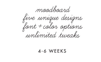
Even though my email style is "child writing home from summer camp," Allison responded and sent me her pricing sheet, which, in addition to being well-designed, laid out very clear options and pricing. I picked the "Fresh Start Package" with added web design setup.
Allison sent a detailed contract and a branding questionnaire, then we got on the phone to talk about what I thought I wanted, including logos I did and didn't like and why. I had a pretty good idea of the color scheme I wanted, and used Adobe's color palettes to pick a few I liked, like this and this.
After Allison and I talked on the phone and she did some ninja-level translation of my ramblings into concrete ideas, she sent me this moodboard.
We sent a lot of emails back and forth, and Allison came up with 5 logo options (below). I was VERY excited about them. I felt like Allison had really listened to what I wanted, even when I hadn't articulated it well. Not every option felt right for Girls Like You and Me, but I liked them all, so I was very happy.
It's pretty obvious which one I chose. You can see that the font is different now; I wanted something a little bit softer, and after we went through a few more options, Allison suggested Raleway semibold. The icons we use were Allison's idea, and she's created more as the site has evolved. It's been a collaborative process. After phone calls, about 75 emails, and one lunch date, I ended up with a cool logo, a great-looking site, and all the materials I needed to create on-brand content on an ongoing basis.
The final logo set!
Thank you, Allison!
*All images courtesy of Allison Bhatta


